Responsive themes or templates display well across different screen sizes and device types. That includes desktop computers, notebooks, netbooks, tablets, phablets, and smartphones.
Responsive themes matter because 90% of all internet users now have mobile access. This piece asks: what is a responsive theme in WordPress—exactly—and how to use them.
Mobile-Friendly Websites Matter
Not all websites are mobile-friendly—yet! They’re the ones that see falling traffic and low rankings in Google. Today, all major search engines factor responsive designs into their ranking algorithms. They don’t want to send mobile web searchers to sites that are hard to navigate.
Viewing Habits Are Changing
Back in the day, a webmaster’s biggest headache was to get a site looking good cross-browser. That hasn’t gone away, but the rise in smart devices added to that headache. Or at least it did until responsive themes for WordPress came along. The way we view and interact with online content has changed for good. Site owners must change too if they’re to survive.
How Responsive Designs Work
Responsive designs react appropriately to different devices, screens, and orientation. Page elements alter size, move position, and even change shape to accommodate the display. A smart response prevents text, images, and other things from overlapping or bunching up.
For example, a top menu may automatically move down on a smaller screen so that it doesn’t hit the logo. Font sizes can shrink, and the site navigation may differ with each new screen size.
Is My WordPress Site Responsive?
Not sure if your WordPress website is responsive or not? If you’ve only ever viewed it on a desktop computer, then it’s time to check it on other devices.
What to Look for in a Responsive Theme
Any fully-responsive theme is going to work, but some of them serve sites better than others. Below are the types of attributes to look for in a WordPress responsive design:
- Fast response times
- Compatible for multiple types or website
- Well optimized for the search engines
- Compatible with all popular WP plugins
Don’t ignore the tech specs
Tech specs are tedious, but please don’t ignore them. All the popular theme websites give a summary of crucial data at the side of a template. Typical specs to take note of include:
- Layout: Responsive
- Active Installations
- Last Updated:
- Creation or Built Date:
- WordPress Version:
- PHP Version:
- Gutenberg Editor Optimized:
- Widget Ready (Yes/No)
- Compatible Web Browsers:
- Included Files:
If a WordPress theme is not responsive in 2020, it’s of little use. If the product doesn’t mention this, or it reads ‘Fixed’, then it’s not responsive. Ask any questions you have at the WordPress Community Help & Support Forums if you’re uncertain.
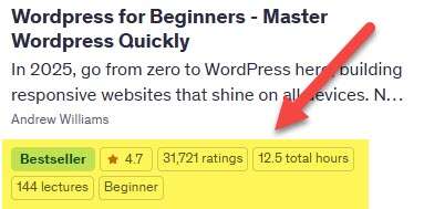
Don’t skip the ratings
It’s easy to find the most popular responsive themes. Look at star ratings and the total number of reviews at the side of a template. Check the comments too. See how fast theme builders respond to user remarks or questions about the product. If there’s a slow or no response, then the product support from that author is also likely to be delayed or ignored.
A brand new design could be an excellent choice, but it might not be too. You don’t want to gamble with the unknown if you’re new to site building and maintenance.
The screenshot below shows the things to look out for with a responsive WordPress theme:

Live Preview
Most responsive themes offer a live preview, so you’re not restricted to only images. Preview buttons are on the right side of all theme pages in the official WordPress repository.
Open this theme to follow along with the next sections.
Clicking the Preview button to see the live preview of this theme:

The responsive theme preview is on the right of the browser.

You can reduce the size of any web browser by clicking its Restore Down icon.

Use the drag handles to see the responsive live theme at work.

Notice how the ‘Previewing Another WordPress Blog’ text now spans over two lines. Scroll down with this or any themes to see resized images and other readjusted site elements.
Non-Responsive WordPress Themes
There are options if you have an older WordPress static theme? One is to change it (recommended). It’s not as difficult as it sounds. All your content stays in place, though there are other tweaks to fix like logos and style sheets. Plugin compatibility is something else to check with any theme change. Not everyone wants the hassle for these reasons.
It’s also possible to make a static theme responsive with code tweaks to the following areas:
- Columns and tables
- Flexible images and embedded video
- Ensure typography is readable
- Others (depending on the template)
A typical theme includes the following elements: body, menu, wrapper, header, sidebars, footer, and main content. It’s necessary to check the theme’s HTML structure and CSS. All WordPress web elements need to change from static to fluid. It’s not wise to mess with any of this unless you have experience or the time to learn.
Where to Find Responsive Themes?
WordPress is the backbone that carries millions of websites worldwide. It’s not difficult to find responsive themes as there are now thousands available. The best place to start is WordPress’ official WordPress Themes page. Theme Forest is also an excellent resource for exploring reactive WP templates. Allow yourself time to browse and become familiar with these products.
As with all themes, there are free options and those that cost. The paid ones tend to average $50 but can go as high as $200 or even more. Costlier themes have more features, but that’s only useful if you need what’s on offer. Look for the number of items sold on a premium product’s page to gauge its popularity with WordPress users.


